[rus] «Маяк» — это дом-интернат для детей с ограниченными возможностями. Учреждение стремится уйти от формата работы интерната и стать центром помощи для семей с детьми группы ОВЗ, поэтому айдентика становится памятником и напоминанием о том, как быть не должно.
[eng] «Lighthouse» - boarding school for disabled children. The aim of the institution was to move away from the working format of the boarding school and become a center of assistance for families with children of the group of OVZ, so branding was to become a monument and a reminder of how not to be.

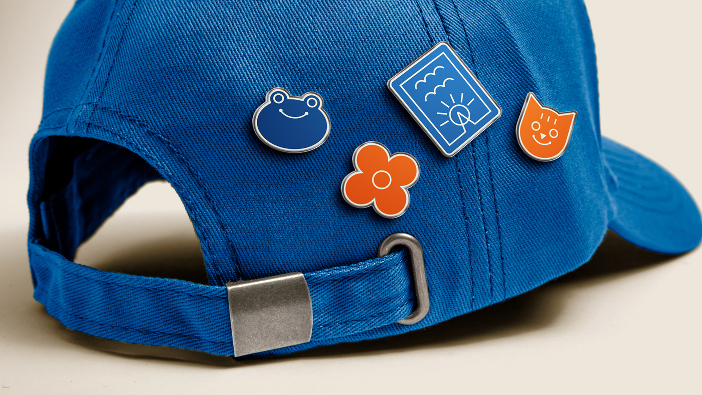
[rus] Значок маяка является GPS-координатой для взрослых и лучом надежды для детей.
[eng] The beacon icon is a GPS coordinate for adults and a beacon of hope for children.

[rus] В основу фирменного стиля легли схемы радиомаяка, который с помощью световых сигналов помогает кораблям ориентироваться в трудной ситуации, приводя к ее решению. Как ребенок нуждается в поддержке и направлении в начале своего жизненного пути, так и взрослому необходимо напоминание о том, как важна роль родителя в судьбе ребенка.
[eng] The company style was based on the schemes of the beacon, which with the help of light signals helps ships navigate the difficult situation, leading to its solution. As a child in need of support and guidance at the beginning of his or her life’s journey, so an adult needs to be reminded of the importance of the parent’s role in the child’s future.

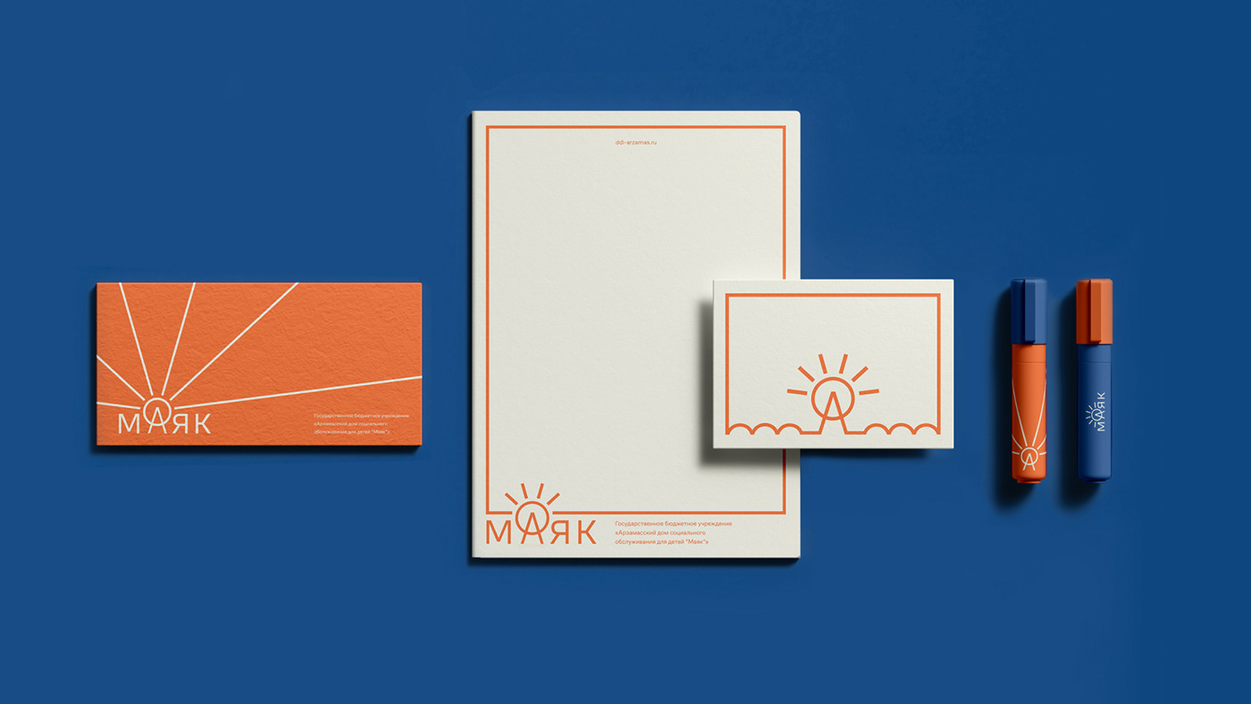
[rus] Знак маяка становится начальной точкой в схеме: его лучи рассеиваются, создавая рамку для всего рисунка.
[eng] The beacon sign becomes the starting point in the scheme: its rays scatter, creating a frame for the whole pattern.


[rus] Стиль является необходимым путеводителем, помогающим взрослым и детям не заблудиться на пути к счастливой жизни.
[eng] The style is a necessary guide, helping adults and children not to get lost on the road to a happy life.

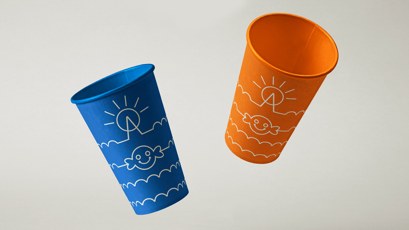

[rus] Основной задачей при создании айдентики стал перевод схемы из сложной и непонятной для детей конструкции во что-то простое, по-доброму наивное и напоминающее рисунки из обучающих раскрасок, которые будет легко повторить даже самым юным художникам.
[eng] The main task in the creation of the branding was the translation of the scheme from a complex and incomprehensible for children to something simple, good naive and reminiscent of drawings from educational colorings, which will be easy to repeat even the youngest artists.